

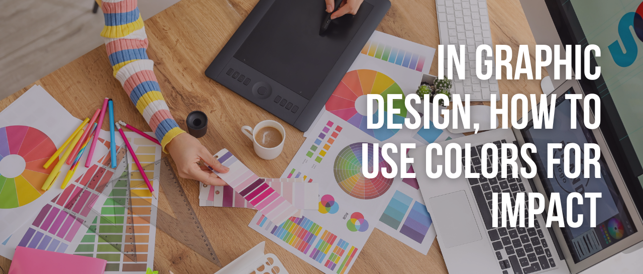
In Graphic Design - How to Use Colors for Impact
Life is all about colors. Without colors, a world in black and white would be so dull that life itself would perhaps not be worth living. The use of colors allows one to decorate an object and to get a degree of visual pleasure from it and it is supposed to make things look nice. The use of colors or not using colors also had a very deep emotional and psychological impact on the wider public mind. In a world full of colors companies and their graphic designers are trying to use them to elicit some feelings and emotions from a specific target audience. The aim of graphic designing is crystal clear and is essential for any business these days.
There have been many research studies that have been regarding consumer behavior and how the public looks at something and what impact a particular set of visuals have on the people who are looking at these colors.
The psychology of logo design has to be kept in mind when making any kind of material like websites, business cards, brochures, and several other countless things.
Here Is How You Can Ensure The Emotional Impact of Colors When Creating A Graphic Design.
Emotional Impact Of Colors when making a great looking graphic design
Colors are not useless. The use of colors causes a certain impact on the hearts and minds of anyone who is looking at these things. The following list includes some colors and gives a brief description of what kind of emotions one can expect when using them on your materials. Not every color combination is best for every kind of situation so without any further to do let's get into it.
● White – This has always been the color that brides wear on their wedding day. It is supposed to signify all things sweet and nice. In fact in the popular imagination, even heaven is going to be an all-white utopia with white clouds, horses, and whatnot.
The color white gives people a sense of security, lightness, relaxation, and above all else a degree of complacency. It is for this reason and more that white is also the color of houses, buildings, and walls. It is particularly popular as an interior color as people love being comfortable in their own homes.
● Pink – You might find it a shock that pink was at one time a color for boys. Today things have changed totally and is now almost exclusively girly things. Pastel pinks and soft things show compassion and a feeling of kindness. Pink is playful, nostalgic, and a deeply nurturing color from our childhoods.
Having said this pink has two sides to it, both innocence and at the opposite end, it shows a deep and burning passion. The use of hot and bright pink colors is more commonly thought of as being related to lust, romance, and love. The color is used to express a certain need for lust, romance, and love. However, it is not as urgent or serious as red.
Also, along with other colors like yellow and red the color pink is used to show a degree of immature, innocent, and childishness. Is because of its feminine and modern association pink oftentimes is associated with being too timid, weak, and emotional. Lastly, it shows a degree of relaxation and tranquility.
● Green – Green is also a color that has a lot of emotions that are attached to it. In nature, it is a very rampant color and is most often associated with the idea of growth in nature. When we think about mother nature and look at the host of shades of green that express and symbolize life and renewal. Green is known to show abundance and is considered to be something showing security, rest, and peace. The color green is most often about relaxing and chilling out. It is for this reason that for instance there are green rooms where people can wait. A lot of doctors also have green rooms or spaces in their medical practices where they help patients relax.
The color green helps you to better make decisions and improves the sense of balance in the human brain. However, the dark side is that the color green also has a negative association with things like possessiveness, envy, and materialism.
The color green is a combination of two basic colors yellow and blue.
● Blue – The color blue is all about rest and releases chemicals in the body that make it relax, In mother nature, it also increases balance and calmness.
Another thing about the color blue is that it is dramatic and very dynamic. The result of this is that it leads to a sense of euphoria. However, the problem with the color blue is that if it is overdone it might make people think of you as being cold and harsh.
The color blue is all about showing something as being confident, sober, significant, and highly important. This is the reason that blue is the uniform of corporate offices and professional police forces across the United States. It indicates a sense of conservatism, unity, stability, and intelligence.
Also, blue is a color of strength. The dark blue color for instance evokes a sense of stability, expertise, and depth.
The color blue should not be used to promote cooking and food businesses, the reason being that blue does not encourage people to eat more and in fact, does quite the opposite of that. The only way in which the color blue can and should be used is with a combination of warm colors such as red, yellow, or blue to make a high-impact and highly vibrant design. The combination of red, blue, and yellow for instance is a very popular combination one can go with.
Lastly, when the color light blue is used it is something that is supposed to show softness, understanding, healing, and tranquility. On the other hand, dark blue is the total opposite and shows a high degree of power, knowledge, integrity, and seriousness.
● Dark blue & grey blue– Sadness, and strength
● Red– Failure, danger, mistakes, sensuality, warmth, and energy.
● Light yellow– Useful to show hunger, optimism, cheerfulness, and spontaneity
● Bright yellow– Irritable and dangerous
● Yellow green– Shows Nausea
● Purple– Prestige, introspection, security, and sensitivity.
● Orange– The color orange shows Vitality, clarity and hunger
● Brown– Shows relaxation, vitality and positivity
● Black– It shows virility, stability and rationality.
Design?
We have helped thousands of business owners from all around the world with their graphic design needs such as logo design, website design, social media posts, baContrast Between Text And Background Colors
When we make a graphic design we need to use colors and make sure that the background and the text should be contrasting. The text needs to be legible, one should be able to clearly read the text in such a way as to allow a business to make sure that its message goes across. There needs to be a sharp contrast between the use of light and dark colors.
When the hue is selected for the background colors and the text, we need to ensure that we incorporate the right combination to make sure that it does not stress one's eyes too much.
One common way in which designers work is that they choose a dark color and move it to the top and have light colors at the very bottom. Also, let us take a look at some of the most common kinds of color combinations that people use on a day-to-day basis.
● Black on Yellow This kind is the easiest to read and is the most common choice among designers.
● Black on White
● Yellow on Black
● White on Black
● Blue on White
● White on Blue
● Green on White
● White on Green
● Red on White
● White on Red [ least legible]
Use Online Color Tools To Select Right Color Scheme to make the right graphic design
It is not easy to get the colors right and it is often a time taking and difficult process for anyone. However, there are a ton of different tools that are on the internet that are not expensive to use and allow one to choose a color combination and design in a few short moments and save time, energy, and money. The other benefit of using this is that one can experiment with several different looks and finally find one that is most suited.
We Give You Here A List Of Online Tools For Color Selection
COLOURlovers –
This website is a great place to get your hands on some very cool kinds of color palettes. You can just search for the kind of color you are looking for and boom. This website lets you stay on top of your game and tells you the latest fashion and trends as well.
ColorBlender –
This website helps you blend colors and make a unique color combination mixture of your choice. There are tons of colors to pick and choose whatever you want.