

How to Use Colour Psychology in Home Design - Our Colours
Colour psychology is a pivotal aspect of interior design, influencing the ambiance and emotional resonance of a home. By thoughtfully selecting hues, homeowners can craft spaces that not only reflect their personal tastes but also promote desired moods and behaviors. In the UK, where diverse architectural styles and cultural influences abound, integrating colour psychology into home design can significantly enhance living environments.
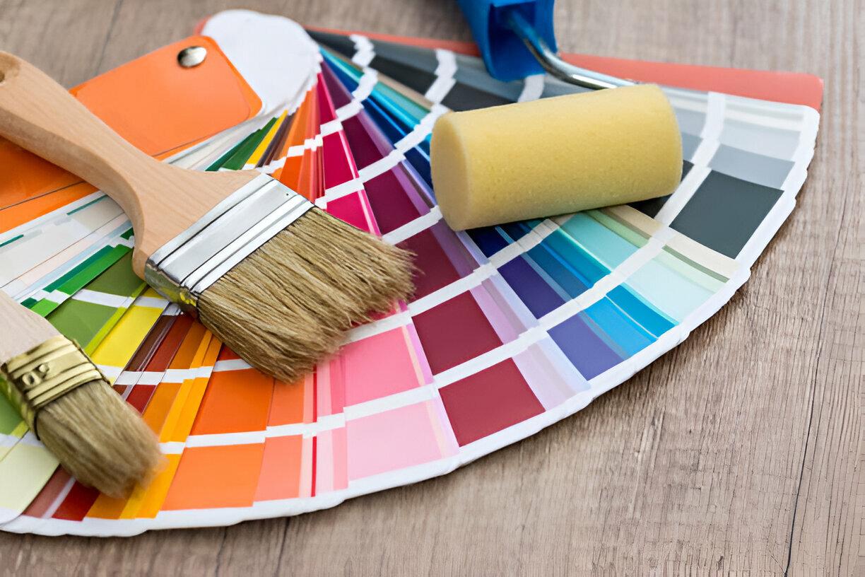
Understanding Colour Psychology
Colour psychology examines how different shades affect human emotions and behaviors. Warm colours like reds, oranges, and yellows are typically stimulating and energetic, while cool colours such as blues, greens, and purples tend to be calming and relaxing. Neutral tones, including whites, greys, and beiges, offer balance and serve as versatile backdrops for other colours.
Applying Colour Psychology to Various Rooms
Living Room
As a central gathering space, the living room benefits from warm and inviting colours. Soft yellows, warm neutrals like beige and taupe, and muted reds foster conversation and create a cozy atmosphere. However, it's advisable to avoid overly bright colours that might overstimulate or not appeal to all guests.
Kitchen
The kitchen, often considered the heart of the home, thrives with bright and cheerful colours. Shades like yellow can stimulate appetite and happiness, while greens represent health and freshness. Conversely, dark colours might make the space feel cramped and less inviting.
Bedroom
For rest and rejuvenation, bedrooms should incorporate cool and calming colours. Blues, lavenders, and soft greens promote relaxation and tranquility. It's best to steer clear of stimulating colours like bright reds and oranges in these spaces.
Bathroom
Bathrooms benefit from clean and fresh colours. Whites, light blues, and soft greens can create a spa-like atmosphere, enhancing feelings of cleanliness and relaxation. Dark and heavy colours may make the space feel smaller and less inviting.
Home Office
Productivity and focus are key in a home office. Neutral and soft colours like light greys, soft blues, and greens are ideal. Green, in particular, is known to reduce eye strain and promote focus, while blue can enhance productivity. Overly vibrant colours might be distracting in this setting.
Accent Colours and Balance
Introducing accent colours is an effective way to incorporate colour psychology without overwhelming a space. This can be achieved through furniture, decor items like throw pillows and rugs, or accessories such as vases and lamps. Maintaining balance is crucial; employing the 60-30-10 rule—60% dominant colour, 30% secondary colour, and 10% accent colour—can guide harmonious design. Additionally, mixing warm and cool colours adds visual interest, and considering natural light ensures colours appear as intended throughout the day.
Personal Preferences and Cultural Considerations
While general guidelines are helpful, personal preferences play a significant role in colour selection. Homeowners should choose colours that resonate with them, fostering happiness and comfort. Experimenting with different shades and combinations can lead to a personalized and satisfying design.
In the UK, cultural and regional factors may influence colour choices. For instance, the resurgence of 'grandmacore'—a trend embracing vintage aesthetics with florals and clashing prints—reflects a desire for nostalgia and comfort. Similarly, the revival of bold 80s decor trends indicates a shift towards more vibrant and personalized interiors.
Practical Tips for Implementing Colour Psychology
-
Start Small: If hesitant about bold colours, begin with small accents like cushions or artwork before committing to larger areas like walls.
-
Test Samples: Paint small sections of a wall to observe how colours interact with light at different times of the day.
-
Consider the Entire Home: Ensure a cohesive flow by selecting colours that complement each other throughout the house.
-
Use Quality Paints: Investing in high-quality paints ensures longevity and a better finish, enhancing the overall aesthetic.
Conclusion
Integrating colour psychology into home design is a powerful tool for creating spaces that are not only visually appealing but also emotionally supportive. By understanding the psychological impacts of different colours and thoughtfully applying them, homeowners can transform their living environments to better suit their needs and preferences. For those seeking expert guidance and quality products, Nevis Paints offers a comprehensive range of paints and finishes to help bring your vision to life.