
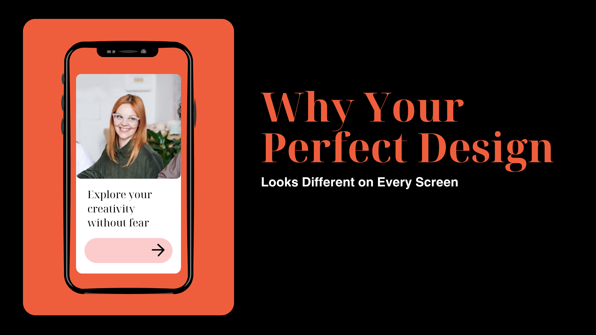
Why Your Perfect Design Looks Different on Every Screen
I swear, if I see one more client screenshot their feedback using a 2013 Android phone with 32% brightness, I might just move to the mountains and design posters for goats. You know the feeling, right? You spend hours perfecting a layout, tweaking colors, balancing fonts, and ensuring your pixels are practically holding hands in harmony, and then someone says, “Uh, why is the blue different on my laptop?”
Welcome to my life as a professional designer in the digital age , where your design is a shape-shifting illusion, and no two people on Earth ever see it the same way.
And before you ask , no, Karen, your monitor is not “broken.” It’s just that reality bends a little when it passes through different screens, file formats, and internet speeds.
The Illusion of the Perfect Design
Let’s be honest: we, designers, are control freaks in disguise. We want things pixel-perfect, aligned, centered, consistent , like digital monks meditating in Figma. But here’s the punchline , perfection is a myth. You can have the cleanest layout in the world, but once it leaves your device, chaos takes the wheel.
I still remember the first time this hit me hard. I had just finished a homepage redesign for a client. It looked stunning on my MacBook , crisp whites, elegant gradients, typography that could make Helvetica blush. Then I opened it on my old Dell monitor. Boom , it looked like someone poured dishwater over the whole thing.
The color calibration difference was brutal. On my Mac, the soft pastel pink was sophisticated; on the Dell, it looked like expired strawberry milk. That’s when I realized , design isn’t just what you create. It’s what survives the trip to someone else’s screen.
Every Screen Has Its Own Personality (and Mood Swings)
I’ve started thinking of screens like people. My phone is bright, over-energetic, and shows everything 10% more vivid than reality. My office monitor? Grumpy. It dulls everything like it’s judging me. And the client’s laptop? Probably hasn’t been color-calibrated since Obama was in office.
Even the smallest thing , like brightness or ambient light , changes everything. Ever tried showing a logo in a café with yellow lighting? Suddenly your sleek modern gray looks greenish-brown, like old chewing gum.
That’s the beauty and the curse of design: it doesn’t live in one space. It’s constantly adapting, morphing, arguing with pixels, and pretending to be stable.
The Great Browser Betrayal
Now, let’s talk browsers , the silent assassins of designers’ sanity. I once created a hero section that looked divine on Chrome. I opened it in Safari, and my header spacing had a midlife crisis. Firefox, meanwhile, decided to center-align something that was supposed to be left.
It’s like your design is going through three different stages of grief, depending on where you view it.
And mobile? Oh, mobile. Designing for mobile is like trying to fit an elephant into a shoebox while the box keeps resizing. I once had a layout that looked fantastic on iPhone 14 but completely imploded on a Samsung A20. Buttons overlapped text. Fonts shrank to microscopic size. I swear I saw a div tag cry that day.
Color Theory Meets Reality (and Reality Wins)
Every designer has that one heartbreak story involving color. Mine was a shade called “Calm Ocean.” I handpicked it, loved it, and even made a moodboard about it. But when exported to another device, it looked like “Mild Depression Blue.”
Here’s the thing: color profiles and display tech don’t play nice. sRGB, Adobe RGB, DCI-P3 , these names sound cool, but they’re basically gangs fighting over who gets to show your design first. The moment you export a mockup or image, some of those beautiful details get lost.
And guess what helps me sometimes? Converting files properly. There are days when switching from PDF to PNG saves the day. PDFs sometimes distort visuals depending on viewer settings, while PNGs preserve color integrity and crispness , perfect for quick client previews. It’s not a magic trick, but it helps me sleep at night.
When Clients Think It’s “Your Fault”
If I had a dollar for every time a client said, “It doesn’t look like the mockup,” I’d have enough money to buy Adobe (and delete the pen tool just for fun).
What clients don’t see is that design is like cooking , you can follow the same recipe, but everyone’s kitchen (a.k.a. screen) will make it taste different.
Sometimes they’ll send a screenshot, and I’ll squint, trying to recognize my own work like a parent looking at a blurry school photo. “That’s… my layout?” I’ll think. But then I see it , text wrapping weirdly, colors slightly off, and margins playing hide and seek.
That’s when I explain , gently, like a kindergarten teacher , “Different devices display content differently.” And they nod politely before saying, “So can you fix it?”
Sure, let me just reprogram the entire concept of screen rendering, Sandra.
File Formats: The Silent Culprits
Here’s a secret: half of our visual chaos comes from file formats. You think JPG, PNG, SVG, and PDF are just labels? Nope. They’re little gremlins waiting to mess with you.
PDFs are great for crisp vector details, but they sometimes reinterpret colors or scaling depending on viewer software. PNGs? Reliable but heavy. JPGs? Fast but slightly blurry. It’s like choosing between pizza toppings , there’s no perfect combo.
One time, a developer uploaded a PDF version of my hero banner instead of the PNG. The colors shifted, text got thicker, and suddenly, my minimalist vibe looked like a circus poster. I had to politely message, “Hey, could you maybe switch that to PNG?” The moment they did , boom, problem solved. It’s these small things , like knowing when to use a PDF to PNG conversion , that make or break the final delivery.
When “Perfect” Isn’t the Goal Anymore
After years of wrestling with layouts, pixels, and mismatched displays, I’ve stopped chasing perfection. I aim for consistency instead , the kind that feels right across platforms, even if it’s not identical.
You can’t control how people view your design, but you can control how it adapts. Make it flexible. Make it forgiving. If it still looks decent on a six-year-old Lenovo, you’ve done your job.
Sometimes, imperfection adds personality. The slight difference in contrast or spacing? That’s how your creation breathes in the real world. The digital world isn’t static , it’s messy, diverse, and unpredictable. And maybe that’s not a bug , maybe that’s the beauty.
Lessons from the Madness
So, what have I learned after all these visual rollercoasters?
-
Color profiles are sneaky liars. Always test your work on multiple devices before sending it off.
-
Clients will never calibrate their screens. Accept it.
-
File format matters more than you think. A quick export change can save hours of confusion.
-
Good design is adaptable. Perfection is nice, but relatability wins.
-
Humor helps. If you can’t laugh at the chaos, you’ll cry into your RGB palette.
At the end of the day, every misaligned pixel, every washed-out tone, and every client screenshot teaches you something new about the fragile magic of visual storytelling.
The Designer’s Sanity Checklist
If you’re a designer like me, here’s a small ritual that keeps me (somewhat) sane:
-
I preview my designs on at least three devices.
-
I use neutral background lighting while finalizing colors.
-
I save one version as PDF, one as PNG , because trust issues.
-
And I always, always remember: no one else sees your design exactly like you do.
It’s not failure. It’s perspective.
The Irony of Modern Creativity
We live in a time where tech gives us endless creative freedom , and yet, it also ruins our work in the most hilarious ways. Fonts jump, images stretch, colors fade. But maybe that’s what keeps us human. If everything looked identical everywhere, design would lose its soul.
So, next time your work looks weird on someone’s screen, take a deep breath. Laugh. Make a meme about it. Then go tweak it again, because let’s be honest , you’ll never stop chasing “almost perfect.”
And maybe that’s what real design is about: not control, but conversation. Not perfection, but connection , even if it means surviving a few PDF conversions and monitor meltdowns along the way.
Final Thoughts
If you’ve made it this far, congrats , you’ve officially been part of my therapy session. But seriously, this is what being a designer feels like today: constantly translating visual emotion through unreliable devices and unpredictable tools.
Every project teaches you patience, humility, and a bit of dark humor. Because at the end of the day, you’re not just creating visuals , you’re crafting experiences that live (and occasionally glitch) in a billion different realities.
And honestly? That’s what makes it worth it.

 Arabic
 Français
 Español
 Português
 Deutsch
 Türkçe
 Dutch
Dutch
 Italiano
 Russian
 Romaian