

How a Design System Enhances Brand Consistency Across Digital Platforms
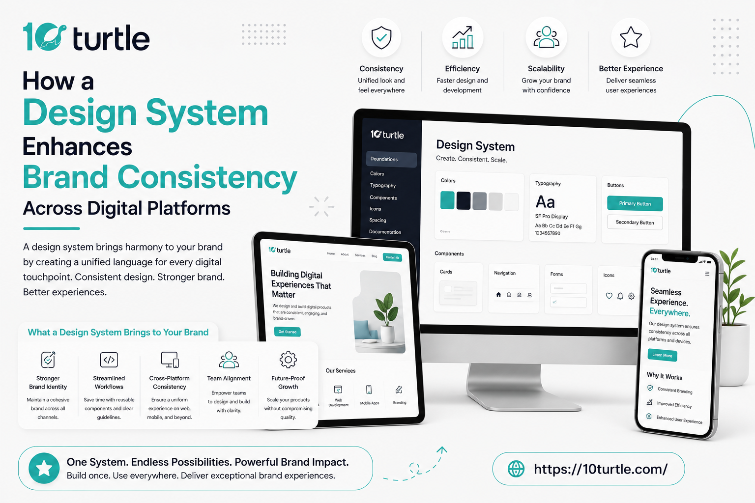
Every growing company in the United States eventually hits the same wall: the website looks one way, the mobile app looks another, and the sales deck feels like it came from a different company altogether. This is exactly where a unified design system becomes the backbone of a cohesive brand identity. Whether you call it a UI component library, a style guide framework, or a design language system, the goal is the same making sure your brand consistency across digital platforms never breaks, no matter how many teams, tools, or touchpoints are involved. In this post, we'll walk through why this matters, how U.S. companies are using it today, and what it means for your business going forward.
What Is a Design System, Really?
A design system is a shared set of design standards, reusable components, and documented guidelines that teams use to build products faster while keeping visuals, tone, and interaction patterns consistent. Think of it as a single source of truth for typography, color palettes, spacing, iconography, and even the way buttons respond when clicked. Instead of a designer manually recreating a header for the fifth app screen this month, they pull from a pre-approved component library that already matches brand standards.
Large U.S. organizations like Airbnb, IBM, and Salesforce popularized this approach with open-source systems such as Airbnb's design language, IBM's Carbon Design System, and Salesforce's Lightning Design System. These aren't just internal tools they're publicly documented frameworks that smaller businesses now study and adapt for their own cross platform brand identity needs.
Why Brand Consistency Across Platforms Actually Matters
Consumers today move fluidly between a company's website, mobile app, email newsletters, and even smart devices. A 2024 Lucidpress-style brand consistency study found that inconsistent branding can cost companies significant revenue because it erodes customer trust. When your logo placement, button styles, or messaging tone shift from one platform to the next, users subconsciously question whether they're still dealing with the same trustworthy brand.
A well-built scalable design system solves this by enforcing rules at the component level, not the page level. That means when a designer updates a color token or a spacing rule, that change automatically propagates across the web app, mobile app, and even internal admin dashboards without anyone manually editing dozens of separate files.
Core Building Blocks of an Effective Design System
- Design tokens: the smallest units of design decisions colors, fonts, spacing values stored as variables so they update everywhere at once.
- Component libraries: reusable UI elements like buttons, cards, and navigation bars built once and used repeatedly.
- Pattern documentation: guidelines explaining when and how to use each component, so new hires don't guess.
- Accessibility standards: WCAG-compliant color contrast and keyboard navigation rules baked directly into components.
- Voice and tone guides: written standards ensuring copywriters and support teams sound like the same brand everywhere.
New Angle: The Rise of AI-Assisted Design Systems in the U.S.
Something worth noting for 2026: American design teams are increasingly pairing traditional design systems with AI-powered tooling. Instead of designers manually documenting every component variant, AI tools now scan Figma files, flag inconsistent spacing, and even auto-generate code snippets that match existing component libraries. Companies in fintech and healthcare industries where compliance and consistency are non-negotiable are early adopters because AI-assisted audits catch brand drift faster than a quarterly manual review ever could. This shift is turning design systems from static documentation into living, self-correcting frameworks, which is a meaningful evolution worth watching if you're building or scaling one this year.
How This Impacts Small and Mid-Sized U.S. Businesses
You don't need to be a Fortune 500 company to benefit. Small business owners running a Shopify store, a mobile app, and a social media presence can start with a lightweight version: a shared color palette, one typography pair, and a handful of reusable UI components in Figma. The enterprise UX consistency playbook scales down easily, and tools like Figma, Storybook, and Zeroheight have made it far cheaper than it was five years ago to maintain a multi platform design framework without a large in-house team.
Practical Steps to Build Your Own Design System
- Audit every existing platform website, app, email templates, social graphics — and list every inconsistency you find.
- Define your core visual tokens: primary colors, secondary colors, font families, and spacing units.
- Build a component library in a shared tool like Figma or Storybook.
- Document usage rules so every team member understands the "why," not just the "what."
- Assign ownership someone needs to maintain the system as the brand evolves.
- Roll it out gradually, starting with your highest-traffic platform before expanding elsewhere.
Common Mistakes Companies Make
Many teams treat their style guide as a one-time PDF instead of a living resource. Others skip accessibility considerations entirely, which later forces expensive retrofits. And some companies build beautiful documentation that nobody on the engineering team actually references, which defeats the entire purpose. A design system only works when it's treated as infrastructure, not decoration.
Conclusion
A thoughtfully built design system is no longer a nice-to-have for U.S. brands competing across web, mobile, and emerging digital touchpoints it's the connective tissue that keeps a brand recognizable and trustworthy everywhere a customer encounters it. As AI-assisted tooling continues to mature, expect design systems to become even more dynamic, catching inconsistencies in real time rather than during quarterly reviews. Whether you're a startup founder or a UX lead at a large enterprise, investing in this framework early pays dividends in trust, speed, and long-term brand equity.
Frequently Asked Questions
Q1: What is the main purpose of a design system?
A design system standardizes visual and functional elements colors, typography, components, and interaction patterns so a brand looks and feels consistent across every digital platform it operates on.
Q2: How is a design system different from a style guide?
A style guide typically covers visual rules like colors and fonts, while a design system goes further by including actual reusable code components, documentation, and governance for how those elements are implemented across products.
Q3: Do small businesses really need a design system?
Yes. Even a lightweight version with a shared color palette and a few reusable components can prevent brand fragmentation as a small business expands to new platforms like mobile apps or marketplaces.
Q4: What tools are commonly used to build one?
Figma, Storybook, Zeroheight, and Adobe XD are among the most widely used tools by U.S. design teams to build and maintain design systems.
Q5: How often should a design system be updated?
It should be treated as a living document, reviewed at least quarterly, with updates made anytime the brand introduces new products, platforms, or visual changes.

 Arabic
 Français
 Español
 Português
 Deutsch
 Türkçe
 Dutch
Dutch
 Italiano
 Russian
 Romaian