

Clear Paths: How to Design Navigation That Users Actually Understand
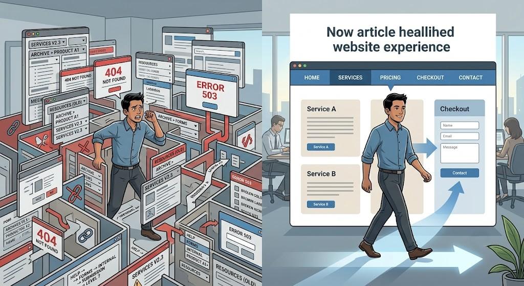
You click onto a website with a simple task. You need to locate a service area or find out about shipping costs. You begin clicking through the menu, but the links seem to lead in circles. After a minute of confusion, you close the browser and try somewhere else.
This happens countless times every day, and it reflects a fundamental failure in website structure. When users cannot find their way, they assume the business is unprofessional or unhelpful. Navigation is not just a menu; it is the entire system that guides users through your content. Getting it right is essential for retaining visitors and encouraging action.
The Issue with Overloading Menus
A very common mistake is overloading the main navigation bar with too many links. Business owners often feel that every page deserves a prominent spot. The result is a crowded, intimidating menu that overwhelms visitors from the moment they arrive.
Psychological research explains why this is counterproductive. When presented with an excessive number of options, people struggle to make decisions. This is known as Hick's Law, which demonstrates that decision time increases with the number of alternatives. A menu with too many choices encourages users to abandon the site altogether.
Keep your primary menu focused and tight. Aim for five to six core categories that represent your most important content areas. Everything else can be nested within these sections. For administrative functions like account settings or login, use a separate top bar that sits above the main navigation. This keeps the primary menu clean and easy to process.
Building Dropdowns That Work
Dropdown menus are necessary for larger websites, but they are often poorly executed. A frequent issue is creating dropdowns that go too deep, requiring users to hover through multiple layers to find a specific page. This is confusing and particularly difficult on touchscreens.
Stick to a single level of dropdown depth. When a user clicks on a parent category, they should see a flat list of related links. Those links should not expand further. For example, under a "Media" tab, you could list "Photos," "Videos," and "Press Releases" all at the same tier. This flat hierarchy is easier to scan and works consistently across devices.
To figure out the best groupings, try a simple exercise. Write each page title on a card and ask a few people to sort them into categories. The results often reveal patterns that you can use to structure your dropdowns. This inexpensive exercise can save you from making assumptions that do not match user expectations.
The Problem with Unconventional Labels
Menu labels are a frequent source of user confusion. Some organizations insist on using unique, branded terms like "The Forge" or "The Bridge" to sound creative. While these names might be memorable internally, they are obstacles for users who just want to navigate quickly.
People scan websites looking for familiar anchors. They expect to see standard words like "About," "Contact," and "Shop." If these familiar terms are missing, users have to pause and interpret each label. This small friction can accumulate across multiple interactions, making the entire experience feel slow and difficult.
Use plain, descriptive language for your menu items. Call your team page "Team" and your pricing page "Pricing." These labels require no interpretation and match user expectations perfectly. When visitors can navigate without thinking, they are more likely to stay and engage with your content.
Evaluating Sticky Navigation
Sticky navigation, where the menu stays fixed at the top of the screen as users scroll, is a popular feature. It can be genuinely helpful on long pages, giving users quick access to other sections without scrolling back to the top.
However, there are drawbacks. A persistent header takes up valuable screen real estate, especially on mobile devices. If the header is too large, it can obscure important content, including headlines and action buttons. This can interfere with the user's ability to complete their tasks.
To minimize the impact, use a slim header and consider a semi-transparent background. Always test your site on an actual phone. Scroll through your pages and watch for any moments when the menu covers interactive elements. If it does, reduce the height or adjust the transparency.
Mobile Navigation Realities
Designing for mobile requires a different mindset than designing for desktop. The horizontal menu that works well on a large screen is completely impractical on a small phone. The hamburger icon has become the standard solution, and users now recognize it instantly.
Some debate remains about whether hiding the menu reduces engagement, but most users are thoroughly familiar with this pattern. The critical factor is the menu's performance when it opens. Touch targets should be large enough for fingers, with adequate spacing to prevent accidental taps.
Think about ergonomics. The "thumb zone" is the area of the screen that is most comfortable to reach with one hand. For most right-handed users, this is the middle portion of the display. Place your most important links within this zone, avoiding the top and bottom corners which require uncomfortable stretching.
The Footer as a Backup Plan
The footer at the bottom of each page serves a vital purpose. It acts as a backup plan for users who have scrolled to the end and still have not found what they need. It offers one final chance to guide them.
This space is ideal for secondary links. Legal documents like privacy policies and terms of service naturally belong here. You can also include links to specific product categories, a careers page, or a full site map. Repeating key contact information, such as a phone number and email address, is also beneficial. A thorough footer helps lost users and supports search engine indexing.
When Expert Guidance Makes Sense
For straightforward sites, you can probably handle navigation design yourself. But as your business grows, the structure becomes more complex. Hidden issues can emerge that are difficult to identify without an external view.
A professional Singapore web designer has expertise in user behavior and information architecture. They can conduct usability tests to see where users encounter difficulties and make data-driven adjustments. When you partner with a web design company, you gain access to this specialized knowledge. A web design company will audit your current navigation and recommend practical improvements. They bring a fresh perspective that is often invaluable. This investment can significantly improve the user experience and drive better outcomes.
Closing Thoughts
The most effective navigation is the kind users do not consciously notice. It allows them to move through your site naturally, finding information without friction. If people frequently ask where to find certain things, your navigation needs attention.
Simplify your menus, use standard language, and prioritize the mobile experience. When you remove barriers, users stay longer and explore more deeply. They read more content, consider more products, and are more likely to complete the actions that benefit your business. Usability is not an optional extra; it is a core requirement for a successful website.

 English
 Arabic
 Français
 Español
 Português
 Deutsch
 Türkçe
 Italiano
 Russian
 Romaian