

Accessible Creative Design: Best Practices for Better UX
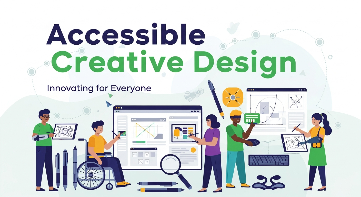
Good design should work for everyone. Yet millions of people encounter digital products every day that weren't built with them in mind—websites that can't be navigated by keyboard, apps with text too small to read, color palettes that leave colorblind users guessing. Accessible creative design closes that gap.
Accessibility in design isn't just a compliance checkbox or a legal obligation (though it is that too). It's a discipline that forces designers to think more carefully about how people actually interact with their work. The result? Products that are clearer, more intuitive, and more inclusive—for every user, not just those with disabilities.
This post breaks down what accessible creative design means in practice, why it matters more than ever, and the concrete steps you can take to build it into your workflow from day one.
What Is Accessible Creative Design?
Accessible creative design is the practice of creating visual and interactive content that can be perceived, understood, and used by people with a wide range of abilities. This includes users with visual, auditory, motor, cognitive, and neurological differences.
The gold standard for accessibility in digital design is the Web Content Accessibility Guidelines (WCAG)—a set of internationally recognized criteria developed by the World Wide Web Consortium (W3C). WCAG organizes accessibility principles around four core pillars: content must be Perceivable, Operable, Understandable, and Robust (POUR). These pillars serve as a practical framework for any accessible design project.
What separates truly accessible creative design from a surface-level pass at compliance is intentionality. It's not about retrofitting a finished product—it's about embedding accessibility into every stage of the design process.
Why Accessible Creative Design Matters
The numbers tell a clear story. According to the World Health Organization, over 1.3 billion people globally live with some form of disability. In the United States alone, approximately 26% of adults have a disability, according to the Centers for Disease Control and Prevention (CDC). That's a significant portion of any potential user base.
Beyond the moral and ethical case, there's a strong business argument. Inaccessible design creates friction for disabled users—and friction means lost customers. Research from the Click-Away Pound Report found that 71% of users with disabilities will leave a website that they find difficult to use. The same report estimated that UK businesses lose approximately £17.1 billion annually due to inaccessible websites.
Accessible design also tends to improve the experience for everyone. Captions benefit people in noisy environments. High-contrast text is easier to read in sunlight. Clear navigation helps first-time users just as much as it helps users with cognitive disabilities. This principle—often called the "curb-cut effect"—shows that features designed for accessibility frequently become features everyone appreciates.
Key Accessible Creative Design Best Practices
How Does Color Contrast Affect Accessibility?
Color contrast is one of the most visible (and most overlooked) aspects of accessible creative design. WCAG 2.1 Level AA requires a minimum contrast ratio of 4.5:1 for normal text and 3:1 for large text. These ratios ensure that users with low vision or color vision deficiencies can read content without strain.
A few practical tips:
- Use tools like Colour Contrast Analyser or WebAIM's Contrast Checker during the design phase—not after.
- Avoid conveying information through color alone. A red error message is meaningless to a colorblind user without an accompanying icon or text label.
- Test your palette against the three most common types of color blindness: deuteranopia, protanopia, and tritanopia.
Tools like Figma and Adobe XD now include built-in accessibility plugins that can flag contrast issues in real time, making it easier to catch problems before they reach development.
What Typography Choices Support Accessible Design?
Typography has a direct impact on readability—and readability is central to accessibility. Font choice, size, line spacing, and letter spacing all play a role.
Some guidelines to follow:
- Use a minimum body font size of 16px for web content. Anything smaller increases cognitive load, particularly for users with dyslexia or low vision.
- Maintain a line height of at least 1.5x the font size to give text room to breathe.
- Avoid justified text alignment. The uneven spacing it creates can make reading harder for users with dyslexia.
- Choose typefaces designed for readability. Fonts like Atkinson Hyperlegible were specifically designed to maximize legibility for users with low vision.
Avoid relying on font weight or italics alone to convey meaning. Assistive technologies like screen readers don't communicate visual styling—so if something is important, say so explicitly in the content.
How Should Designers Approach Accessible Imagery and Media?
Every image, video, and audio file on a digital product needs to be considered through an accessibility lens.
Images: All informational images should have descriptive alt text—a short written description that screen readers can convey to visually impaired users. Decorative images (backgrounds, dividers) should have empty alt attributes (alt="") so screen readers skip them. Alt text should describe what the image communicates, not just what it depicts. For example, a graph showing a 40% drop in sales should have alt text that communicates the trend, not just "a bar chart."
Video and audio: Any video content should include accurate closed captions and, where possible, audio descriptions for visual elements that aren't conveyed through dialogue. Prerecorded audio content should have a text transcript. This benefits not only deaf or hard-of-hearing users but also those in environments where sound isn't an option.
Animations and motion: Automatically playing animations and parallax scrolling effects can trigger vestibular disorders or distract users with attention-related conditions. WCAG 2.1 introduced Success Criterion 2.3.3, which recommends providing users with the option to reduce or disable motion. The CSS media query prefers-reduced-motion makes this easy to implement in web products.
What Are the Best Practices for Accessible Navigation and Interaction?
Many users don't interact with digital products using a mouse. People with motor disabilities may rely on a keyboard, a switch device, or eye-tracking software. Accessible creative design accounts for all of these input methods.
Keyboard accessibility: Every interactive element—links, buttons, form fields, modals—must be reachable and operable via keyboard alone. The tab order should follow a logical reading sequence, and focus states (the visible outline that appears on a focused element) must be clearly visible. Removing focus styles for aesthetic reasons is one of the most common—and damaging—accessibility mistakes designers make.
Focus management: When users open a modal or navigate to a new section of a page, focus should move to the relevant element automatically, then return to the appropriate place when the interaction ends.
Touch targets: For mobile users, interactive elements should be at least 44x44 pixels, as recommended by WCAG 2.5.5. Targets that are too small create frustration for users with motor impairments and, frankly, for anyone using a phone with one hand.
How Can Form Design Be Made More Accessible?
Forms are one of the most common sources of accessibility failures. Poor form design creates barriers at critical moments—sign-ups, checkouts, contact submissions.
Best practices for accessible forms include:
- Always use visible labels. Placeholder text is not a substitute for a label—it disappears once a user starts typing, leaving them without context.
- Associate labels programmatically with their inputs using the
forandidattributes (or ARIA labels where necessary). - Provide clear, specific error messages that explain what went wrong and how to fix it. "Invalid input" helps no one.
- Group related fields using
<fieldset>and<legend>elements, particularly for radio buttons and checkboxes. - Avoid setting time limits on forms. If a time limit is necessary, give users the ability to extend it.
What Role Does Semantic HTML Play in Accessible Creative Design?
Accessibility starts at the code level, and semantic HTML is its foundation. Semantic elements—<header>, <nav>, <main>, <article>, <button>, <h1> through <h6>—give assistive technologies the structural context they need to interpret and navigate content correctly.
A heading hierarchy matters. Screen reader users often navigate pages by jumping between headings. A page that uses heading tags inconsistently or skips levels creates a confusing experience. Keep headings logical, descriptive, and sequential.
Where semantic HTML falls short, ARIA (Accessible Rich Internet Applications) attributes can fill the gap—but use them sparingly. The first rule of ARIA is don't use ARIA if you can use native HTML instead. Overusing ARIA can make accessibility worse, not better.
Building Accessibility Into Your Design Workflow
Accessible creative design isn't a final step—it's a mindset that runs through every phase of a project. Here's how to embed it into your process:
- Audit early: Use automated tools like axe, WAVE, or Lighthouse to identify baseline accessibility issues at the start of a project.
- Design with accessibility in mind: Create high-contrast mockups, use accessible type scales, and build keyboard-navigable prototypes from the beginning.
- Test with real users: Automated tools catch roughly 30–40% of accessibility issues. Manual testing—particularly with users who rely on assistive technology—is irreplaceable.
- Document your patterns: Build accessibility into your design system so that accessible components become the default, not the exception.
- Educate your team: Accessibility isn't solely a designer's responsibility. Developers, content writers, and product managers all play a role.
Accessible Design Isn't a Constraint—It's a Standard
There's a persistent myth that accessibility limits creative freedom. The opposite is true. The constraints that come with accessible creative design—limited color palettes, clear typography, logical structure—often lead to cleaner, more considered work. Designers who internalize accessibility principles tend to produce interfaces that are more usable for everyone.
The shift required isn't technical. It's attitudinal. When accessibility moves from an afterthought to a starting point, the quality of the work reflects it. Users notice. And increasingly, so do search engines, regulators, and the businesses that depend on digital products to grow.
Start with one principle. Audit your contrast ratios. Revisit your alt text. Check your keyboard navigation. Small, deliberate changes compound into products that are genuinely better for the people who use them.

 Arabic
 Français
 Español
 Português
 Deutsch
 Türkçe
 Dutch
Dutch
 Italiano
 Russian
 Romaian